UX Design & Research
Cannabis Equity Illinois

Overview
Cannabis Equity Illinois is a nonprofit organization that aims to promote cannabis justice in the Chicagoland area. They provide a platform for people to find resources on cannabis justice and offer volunteer opportunities for event organizers, policy shapers, creatives, and educators.
During this class, our team wanted to help CEI revamp its website to make it easier for users to get the information they need and help make an impact in the community. The biggest issue we saw with the website was the navigation and overall information architecture. Throughout the 10-week quarter, we ran tests and outlined an updated sitemap which we then put to use in new mobile wireframes.
Role
UX Design + Research
Class
HCI 454: Information Architecture & IX Design
Timeline
10 weeks (June 2022 – August 2022)
User Problems & IA Problems
In order to discover the problems users were having on this website, we conducted a content inventory of the site to document the existing information architecture and examine potential gaps in the content. This provided us with an overarching skeleton of the website’s current information architecture using verbatim phrasing and structures pulled from the website itself.
Throughout this exercise, we noted a significant amount of duplicative or closely related information placed disparately across the website. In order to produce a consolidated set of inputs for downstream research and testing efforts, we generated a list of the unique values captured in our initial content inventory template (removing any word-for-word duplicates found throughout the site). We then conducted an additional review to check for synonymous or overlapping labels present throughout the reduced data set, cross-checking against the current-state website throughout the process to clarify details around the information captured. Any identified redundancies were merged prior to finalizing the inputs for the next steps of the process.
Measuring Success
Our goal was to create wireframes for an updated website that would allow users to find legal assistance, signup for events and volunteer hours, and stay up to date on cannabis regulations. We measured our success based on these metrics:
User success rate during card sort tests
User success rate during usability tests

Existing header at cannabisequityil.org
Scoping an MVP
After looking at the content inventory and making changes to the information architecture, we conducted card sort tests with a total of 45 participants. Results showed success scores between 78-89%. These tests revealed that users had difficulty categorizing 'programs' and 'volunteer' cards. This prompted us to add a third level of navigation to our sitemap.
After restructuring based on the card sort results, we conducted tree tests with 18 Chicagoland residents. A majority of the participants completed the tasks successfully, but those who struggled provided us with useful insights. The results prompted us to rename some primary navigation titles and link some pages together.


Revised Sitemap
Based on test results, we created a revised sitemap with 3 levels:
Level 1 (X.0): overarching categories, clicking these will open a menu of pages
Level 2 (X.X): pages that are nested under Level 1 categories
Level 3 (X.X.X): sub-pages that live inside Level 2 pages

Personas
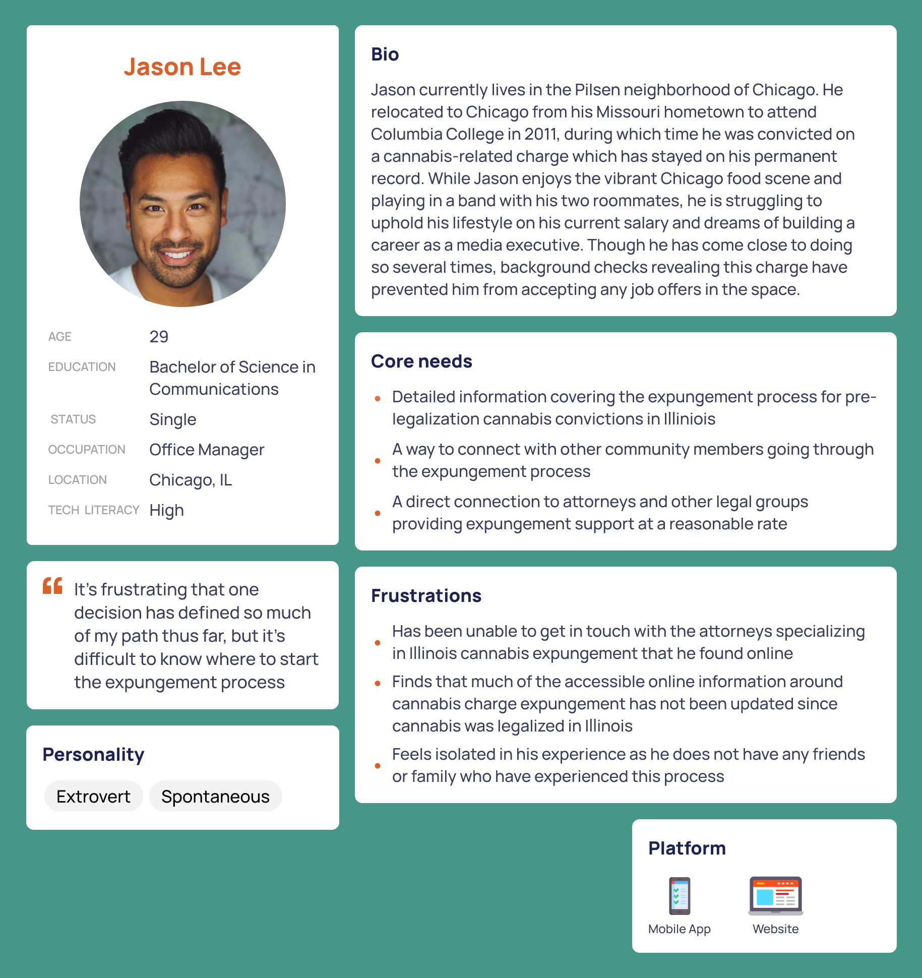
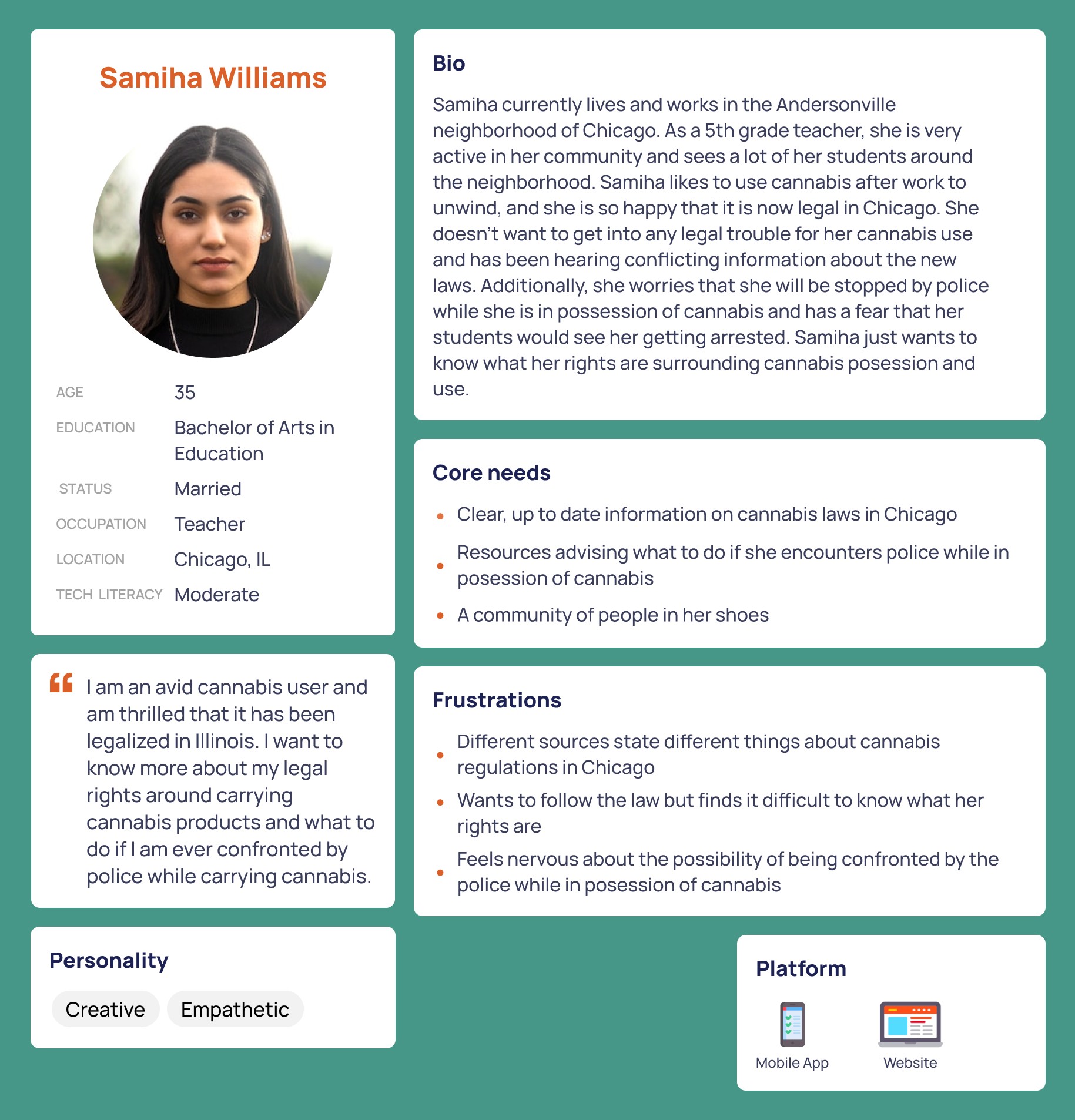
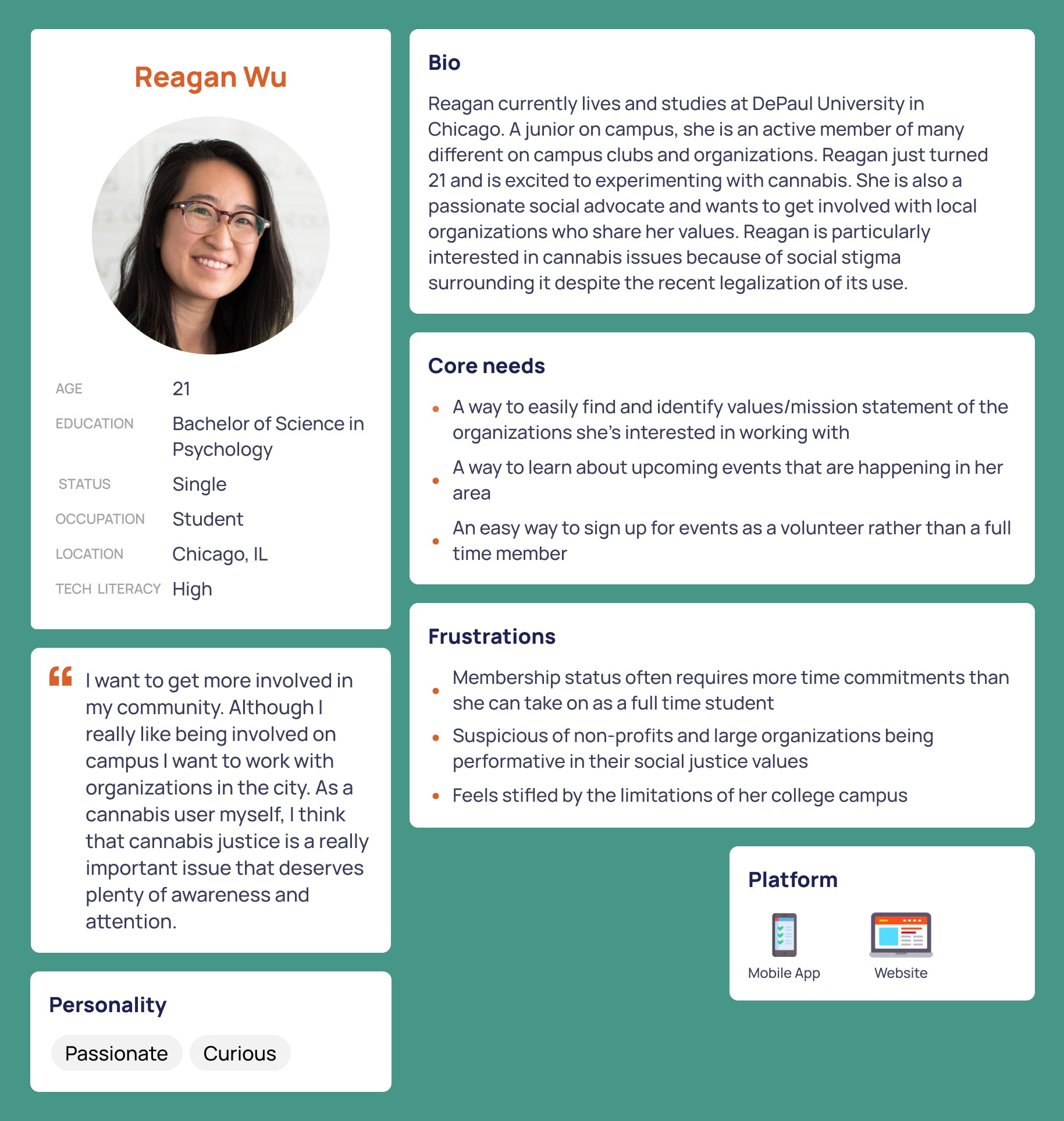
We developed detailed personas to ground our information architecture study and optimize the final-state solution for Cannabis Equity Illinois's target audiences.
Wireframes
Leveraging the insights gathered through our card sort research, we developed initial flows for high-priority tasks within the website. These tasks were: (1) making a donation and (2) finding expungement resources.
Key Task 1: Making a donation
The current task flow for making a donation requires a lot of searching by the user. They then have to copy and paste a url into their browser. Additionally, the link to donate is housed under the ‘Become A Member’ section. This was a point of confusion for users who do not want to become a member, but simply want to make a one-time donation.
To improve this task flow, we first made the link into a button, and then made the donate button a permanent fixture in the header. We also made the donation form embedded in the site so users wouldn’t have to navigate to a new website, making it easier for them to return to the homepage to learn more about the organization. Cannabis Equity Illinois relies heavily on donations and these changes will ease the process for the users.

Key Task 2: Finding expungement resources
The second task was chosen as an example of one of the many resources Cannabis Equity Illinois offers. Currently, expungement resources are housed in several different locations on the site, with differing information: on its own ‘Expungement’ page, and under ‘Programs.’ In our wireframes we made expungement resources accessible via two different routes, but landing on the same page.
Testing
We tested our wireframes with three Chicagoland citizens who were interested in cannabis justice. We asked participants to complete the two key tasks in 1-on-1 Zoom sessions.
Results showed that participants immediately utilized the donate button in the header and had no difficulty completing the first task. However, participants showed confusion in the second task when deciding between ‘Programs’ and ‘Legal & Community Resources.’ This issue may be due to the phrasing of the prompt. Researchers asked participants to “find information and resources on expungement.” This may have been better phrased as “find partner organizations that can help with expungement.”
Key Takeaways
This project was a lesson in structure and simplification. The site started out with a lot of information scattered in different places. Our goal was to find a way to structure the information so that it is understandable and intuitive for the target audience. If implemented, these changes may lead to a greater number of donations, increased volunteer engagement, and a greater impact on the community.
If we could go back and do things a little differently, I would like to observe participants as they complete the card sort task and ask follow-up questions to get further insight into their though processes. Additionally, I would like to continue on with the design process and create a comprehensive collection of wireframes and eventually test them with real users.


