UX/UI Design
Pocket Pass
Overview
This project was assigned in my third quarter of the HCI program at DePaul in a class on prototyping and it is the first project I ever completed that I felt really proud of. The team consisted of four HCI students — two on the research track and two on the design track.
The resulting product PocketPass is a companion mobile application that supports AR functionality for curated spaces and learning environments like museums, observatories, zoos, arboretums, aquariums, and more. PocketPass connects participating institutions to users with the goal of providing curated experiences based on interests, accessibility needs, and time constraints. Additionally, the app offers users a centralized way to search, plan and purchase tickets to any participating PocketPass location.
Role
UX/UI Design
Class
HCI 430: Prototyping and Implementation
Timeline
10 weeks (March 2022 – June 2022)
User Problems
Since COVID-19 restrictions have been lifted and people have begun to feel comfortable in public spaces again, attendance at institutions such as museums, zoos, observatories, and aquariums has soared back to pre-pandemic levels. However, the pre-pandemic problem of navigating a museum, keeping track of tickets, and downloading different apps for each location still remains. Museum visits should be a joyful and educational experience, however the logistics often lead to head ache. My team set out to learn more about this problem and come up with a design solution.
A lot of museums and other institutions have their own app. However, when we interviewed five museum goers, each one of them said they have not visited the same museum twice in one year. They also said they are not likely to download an app prior to their visit since they only anticipate using it about once per year. So, the current solutions on the market are either not being used or causing users to clog their phone with single-use apps.
Measuring Success
In just 10 weeks we wanted to create an app that enhances the overall user experience of visiting a museum or similar location. These are the metrics we used to measure success:
Comprehensive hi-fi wireframes for at least 3 key tasks
Positive feedback through user testing with at least 5 target users


Scoping an MVP
In the ideation stage, our focus was on understanding the users and determining required tasks. Our team used different methods to explore as many ideas as possible, which were later narrowed down and explored further. These methods include but are not limited to design charettes, storyboards, personas, physical mockups, and workflows.
A quick note about monetization: Participating museums would pay a fee to join the app and it would be free for users.
Scenario 1: Choosing a museum and purchasing tickets
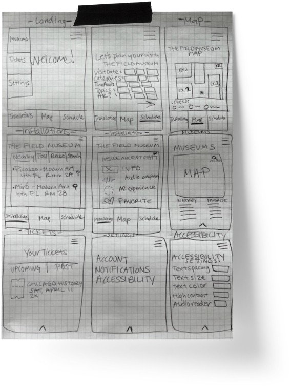
Denise wants to book her next trip to The Field Museum. She’s heard that there is a new AR exhibit called Inside Ancient Egypt and she wants to see what it is all about. She downloads PocketPass to assist with her visit. Denise opens PocketPass and searches for The Field Museum. Her search results list the museum at the top. After entering in her visit information, she purchases a ticket, receives a confirmation and an electronic ticket.
Scenario 2: Viewing museum and exhibit information
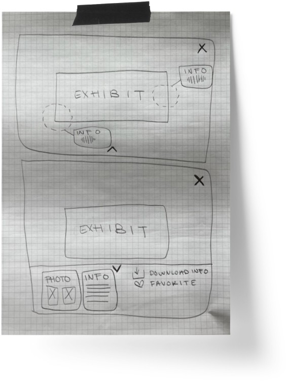
When at The Field Museum, Denise opens PocketPass and accesses information such as maps, events, and exhibits. She pulls up the Inside Ancient Egypt exhibit, accesses details about it, and explores it in augmented reality by placing her phone camera over the exhibit.
Testing
Most users found the functionality easy to understand and were able to complete the proposed tasks during testing. However, we found there were navigational paths that interfered with users completing the testing successfully. Based on the findings from ten usability tests, we revised the wireframes to address user recommendations and feedback. We added a global search feature and made it available on all pages, added filters when searching for museums, and tightened up the information architecture. We also added visual appeal based on our style guide.
Key Takeaways
Our group set out to design a prototype that made the experience of visiting educational and curated spaces more enjoyable for users. Thanks to an agile approach and the unique perspectives of our team members, we created several rounds of prototypes that resulted in strong positive feedback from our target audience. User testing highlighted key functionality that was missing and we saw great improvement in the navigation of the hi-fidelity prototype when implemented. However, as our prototype grew, there was much discussion of implementing a robust navigation that would support our goal of a uniform design across PocketPass locations and ease of use. In future testing, we hope to measure how the visual cues we implemented will resonate with users specifically with new or unique features.
We learned that users look for familiar functionality and that when introducing new terminology and features it should be coupled with support (nudge, quick links, guides, helper text) that the user can take advantage of. Since our test pool was small, we foresee additional recommendations resulting from the expanded functionality and navigation of the hi-fidelity prototype with a larger participant pool.


